CSS border-image-slice property specifies how the image should be sliced that is to be used as an element’s border.
The specified image is always sliced into 9 sections: four corners, four edges, and one middle section. The size of these 9 sections is determined by the top, right, bottom, and left offset values. The values of the four offsets don’t have to be the same. Refer to the image below:
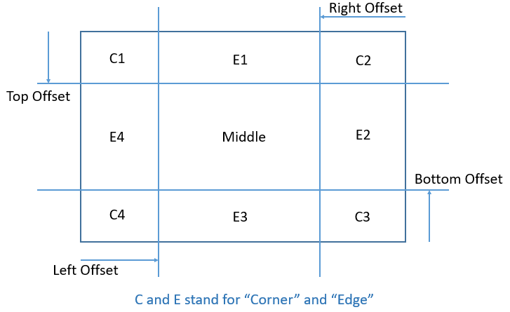
The middle section is generally discarded unless the fill keyword is present.
The border-image-slice property can take 1 to 4 values at a time. These values specify the size of the four offsets. The size of these offsets can be specified using an absolute number or percentage(%).
If only one value is specified:
- border-image-slice: val;
The same value(val) will be used for all four offsets(i.e. top, right, bottom and left). Refer to the example below:
Example:
div{
  border-image-source: url(images/border-diamonds.png);
  border-image-slice: 30;
}
If two values are specified:
- border-image-slice: val1 val2;
The first value(val1) specifies the top and bottom offsets and the second value(val2) specifies the left and right offsets. Refer to the example below:
Example:
div{
  border-image-source: url(images/border-diamonds.png);
  border-image-slice: 30 44;
}
If three values are specified:
- border-image-slice: val1 val2 val3;
The first value(val1) specifies the top offset, the second value(val2) specifies the left and right offsets and the third value(val3) specifies the bottom offset. Refer to the example below:
Example:
div{
  border-image-source: url(images/border-diamonds.png);
  border-image-slice: 30 44 35;
}
If all four values are specified:
- border-image-slice: val1 val2 val3 val4;
The first value(val1) specifies the top offset, the second value(val2) specifies the right offset, the third value(val3) specifies the bottom offset and the fourth value(val4) specifies the left offset. Refer to the example below:
Example:
div{
  border-image-source: url(images/border-diamonds.png);
  border-image-slice: 30 44 35 0;
}
Using the fill Keyword
In all the above examples, the middle section of the image was discarded, only the corners and edges were used for the border.
But, if we don’t want the middle section to get discarded, we can use the fill keyword. If the fill keyword is present, the middle section of the image will be used as element’s background. Refer to the example below:
Example:
div{
  border-image-source: url(images/border-diamonds.png);
  border-image-slice: 30 fill;
}
CSS Syntax
The border-image-slice property has the below syntax:
border-image-slice: number|%|fill|initial|inherit;
Property Values
The border-image-slice property accepts the following values:
| number | Specifies the size of each offset. It basically represents the pixels for raster images and coordinates for vector images. Negative values are not allowed. |
| % | Specifies the size of offsets in percentage(%). The default value is 100%. |
| fill | Specifies that the middle section of the image will also be displayed(By default, it is discarded). However, the middle section is displayed as the element’s background, not the border. |
| initial | Sets the border-image-slice property to its default value(100%). |
| inherit | Inherits the border-image-slice property from the parent element. |
General Info
| Default Value | 100% |
| Inherited | No |
| JavaScript Usage | element.style.borderImageSlice = “33”; |
Related Pages
CSS Tutorial: CSS Borders
