To change the color of a button when the user clicks on it, you can use the CSS pseudo-classes. A pseudo-class is a special type of CSS selector which is used to style elements based on their current state, such as mouse hover, mouse click, focus, etc.
In CSS, there are tons of pseudo-classes available. Each pseudo-class is designed for a specific state of the element and triggers only when the element is in that state.
A button mostly supports the following four pseudo-classes:
- :hover – Specifies the styles for an element when the user hovers over it.
- :active – Specifies the styles for an element when it is active(e.g. button is clicked)
- :focus – Specifies the styles for an element when it is in the focused state
- :disabled – Specifies the styles for an element when the button is disabled
Whenever you click a button, the :active pseudo-class gets activated for that specific moment. So, if you want to change the color of a button when it is clicked, you have to specify the new color inside the :active pseudo-class.
Let me show you this with an example.
Let’s say we have the following button in our HTML file. It has a crimson color background by default. We want to change its background color from crimson to green whenever someone clicks on it.
<!--A simple button-->
<button>Click Me</button>
To change its color from crimson to green whenever it is clicked, use the button:active pseudo-class:
/*Button's normal styles*/
button{
    border: none;
    background-color: crimson;
    padding: 8px 16px;
    border-radius: 4px;
    color: white;
}

/*Change background color to green on click*/
button:active{
    background-color: green;
}
After running the above code, you will get the following output:
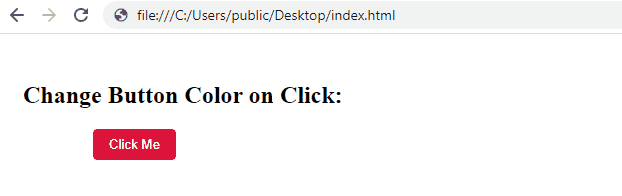
As you can see from the above output, the background color of the button is changing from crimson to green whenever you click on it.
Does the Order of Pseudo Classes Also Matter?
When you are working with pseudo-classes, it is to be noted that they must be written in a specific order, if not, you might get unexpected results.
For example, if you by mistake put the :active pseudo-class before the :hover pseudo-class, the styles written under the :active class will be overridden by the styles written under the :hover pseudo-class.
Let’s say we apply the following styles to a button in order to change the button color to green on click and put the :active before :hover
/*Button's normal styles*/
button{
    border: none;
    background-color: crimson;
    padding: 8px 16px;
    border-radius: 4px;
    color: white;
}

/*Change button color on click*/
button:active{
    background-color: green;
}

/*Change button color on hover*/
button:hover{
    background-color: blue;
}
This will give you the following output:
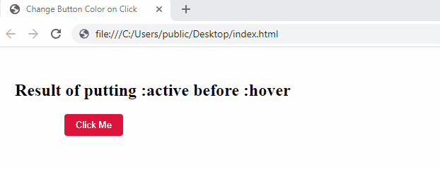
As you can see from the above output, the background color of the button is not changing to green when we are clicking on it, it remains blue only.
Can you figure out why this is happening?
The answer is simple, the order of the :active and :hover is not correct. Therefore, the styles that are written under the :hover is overriding the styles written under the :active pseudo-class.
So, keep the :hover pseudo-class before the :active pseudo-class and things will start working as expected:
/*Button's normal styles*/
button{
    border: none;
    background-color: crimson;
    padding: 8px 16px;
    border-radius: 4px;
    color: white;
}

/*Change button color on hover*/
button:hover{
    background-color: blue;
}

/*Change button color on click*/
button:active{
    background-color: green;
}
Below is the expected output:
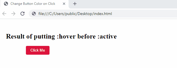
As you see, now, when we hover over the button, its color is changing to blue and when we click on it, its color is changing to green. This is exactly what we expected.
Conclusion
In this article, we learned how we can change the background color of a button when we click on it.
To change the color of a button whenever someone clicks on it, we can use the :active pseudo-class. The :active pseudo-class gets activated only for that moment when you click a button. As soon as you finish clicking, this pseudo-class is removed from the element(button).
Also, when applying the :active pseudo-class to an element, you must keep it after the :hover and :focus pseudo-classes. If this order is not maintained, you might get unexpected results.
Thanks for reading.
