A loading spinner is a widely used element in modern websites and applications which is used as an indication to the user that the data of the webpage or the application is still loading.
This can help to keep the visitors engaged and prevent them from leaving the webpage prematurely.
Other than this, loading spinners are also used as an indicator when the data is being fetched asynchronously from the remote server or when the user submits the form and the data is getting saved in the database.
In this article, we’ll show you how you can create a loading spinner with the help of pure CSS. So without further ado, let’s get started.
Steps to Create a Loading Spinner
From a CSS point of view, a loading spinner is a circular element which has a thick border and rotating around its center with the help of some animations.
So, the very first thing we need to create is the spinner body, which can be created by following the below steps:
- Create a div element with some width and height
- Make the div a circle by setting its border-radius to
50% - Add a thick border around each side of the element
- Make one or two sides border of a different color as per your need
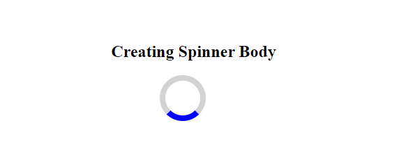
Add a div element to your HTML which has a class="spinner":
<!--Create the spinner body-->
<div class="spinner"></div>
Now, add the below CSS as per the above steps:
.spinner{
    width: 50px;
    height: 50px;
    border-radius: 50%;
    border-top: 8px solid lightgrey;
    border-right: 8px solid lightgrey;
    border-left: 8px solid lightgrey;
    border-bottom: 8px solid blue;
}
This will give you the following output:
Now, we need to rotate this spinner around its center which we can accomplish by applying animations to it.
To add animations to an element in CSS, we can use the animation or its sub-properties.
For now, we need only the following animation sub-properties to rotate our spinner:
- animation-name: It specifies the name of an animation. It is used to bind the animation to a specific element, using the
@keyframesat-rule. - animation-duration: It specifies the time that the animation takes to complete its one cycle. It can be specified in seconds(s) or milli-seconds(ms).
- animation-iteration-count: It specifies how many times the animation should run before stopping.
- animation-timing-function: It specifies how the animation will grow at different points of the animation cycle.
To rotate the spinner, we have to create a @keyframe with some name such as rotate which will rotate the spinner from 0 to 359 degrees. To accomplish that we can use the transform property with the rotate() function.
/*Define the keyframe */
@keyframes rotate{
   0%{
       transform: rotate(0deg);
   }
   100%{
       transform: rotate(359deg);
   }
}
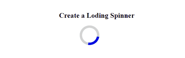
Now, we need to bind this keyframe with the animation-name property. Also, define other parameters of the animation such as animation duration, count, function, etc. using the other sub-properties.
Here is the full CSS code that we need to add:
.spinner{
    width: 50px;
    height: 50px;
    border-radius: 50%;
    border-top: 8px solid lightgrey;
    border-right: 8px solid lightgrey;
    border-left: 8px solid lightgrey;
    border-bottom: 8px solid blue;
    animation-name: rotate;   /* Animation name */
    animation-duration: 1s;   /* Animation duration */
    animation-iteration-count: infinite; /* Animation count */
    animation-timing-function: linear;  /* Animation curve */
}

/*Define the keyframe */
@keyframes rotate{
   0%{
       transform: rotate(0deg);
   }
   100%{
       transform: rotate(359deg);
   }
}
After running the above code, you will get the following output:
Note: Please add the -webkit- prefix for the browsers that do not support the transform and animation properties.
Example 2 – Loading Spinner with top and bottom Border
By adjusting the color and the thickness of the spinner’s border, you can give it a totally different look.
For example, make the left and right borders of the above spinner transparent and the top and bottom border of a similar color e.g. blue.
.spinner{
    width: 50px;
    height: 50px;
    border-radius: 50%;
    border-top: 5px solid blue;
    border-bottom: 5px solid blue;
    border-right: 5px solid transparent;  /* Transparent border */
    border-left: 5px solid transparent;   /* Transparent border */
    animation-name: rotate;   /* Animation name */
    animation-duration: 1s;   /* Animation duration */
    animation-iteration-count: infinite; /* Animation count */
    animation-timing-function: linear;  /* Animation curve */
    margin-left: 70px;
}

/*Define the keyframe */
@keyframes rotate{
   0%{
       transform: rotate(0deg);
   }
   100%{
       transform: rotate(359deg);
   }
}
This will give you the following output:
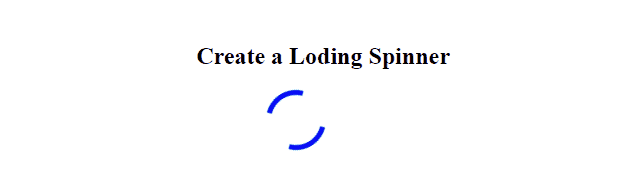
Example 3 – Loading Spinner with Fade Out Effect
Let’s create one more loading spinner which we often see on a lot of websites.
This loading spinner is basically a combination of 12 rods which are placed on the periphery of a circle and separated by an angle of 30 degrees.
To add the loading effects to this spinner, we gradually fade out the background color of each rod using the opacity property i.e. change opacity from 1 to 0 over one cycle of the animation.
Add the below HTML code:
<!--Create the spinner body(12 rods)-->
<div class="spinner">
    <div></div>
    <div></div>
    <div></div>
    <div></div>
    <div></div>
    <div></div>
    <div></div>
    <div></div>
    <div></div>
    <div></div>
    <div></div>
    <div></div>
</div>
Now, add the following CSS code:
.spinner{
    width: 80px;
    height: 80px;
    position: relative;
}

/*Set transform origin and apply animation*/
.spinner div{
    transform-origin: 40px 40px;
    animation: fadeOut 1.2s linear infinite;
}
.spinner div:after {
    content: "";
    display: block;
    position: absolute;
    top: 3px;
    left: 37px;
    width: 6px;
    height: 18px;
    border-radius: 20%;
    background: blue;
}

/*Rotate each rod by 30 deg and add 0.1s delay*/
.spinner div:nth-child(1) {
  transform: rotate(0deg);
  animation-delay: -1.1s;
}
.spinner div:nth-child(2) {
  transform: rotate(30deg);
  animation-delay: -1s;
}
.spinner div:nth-child(3) {
  transform: rotate(60deg);
  animation-delay: -0.9s;
}
.spinner div:nth-child(4) {
  transform: rotate(90deg);
  animation-delay: -0.8s;
}
.spinner div:nth-child(5) {
  transform: rotate(120deg);
  animation-delay: -0.7s;
}
.spinner div:nth-child(6) {
  transform: rotate(150deg);
  animation-delay: -0.6s;
}
.spinner div:nth-child(7) {
  transform: rotate(180deg);
  animation-delay: -0.5s;
}
.spinner div:nth-child(8) {
  transform: rotate(210deg);
  animation-delay: -0.4s;
}
.spinner div:nth-child(9) {
  transform: rotate(240deg);
  animation-delay: -0.3s;
}
.spinner div:nth-child(10) {
  transform: rotate(270deg);
  animation-delay: -0.2s;
}
.spinner div:nth-child(11) {
  transform: rotate(300deg);
  animation-delay: -0.1s;
}
.spinner div:nth-child(12) {
  transform: rotate(330deg);
  animation-delay: 0s;
}

/* Gradually fade out each rod */
@keyframes fadeOut{
    0%{
       opacity: 1;
    }
    100%{
        opacity: 0;
    }
}
After running the above code, you will get the following output:

Conclusion
In this article, we learned how we can create a loading spinner using CSS.
To create a loading spinner, we need two basic things, first, an HTML element with some width and height and a thick border around it with a border radius of 50%.
The second thing we need is the animation or its sub-properties. The animation or its sub-properties are used to apply animations to the spinner so that it can spin around its center infinitely.
Thanks for reading.

