A trapezoid is a quadrilateral that has two sides that are parallel and two sides that are non-parallel. In this tutorial, we will draw a trapezoid using simple CSS & HTML.
There are two easy ways in CSS that we can use to draw a trapezoid:
- Using CSS borders
- Using CSS polygon() function
Let’s discuss each method in detail:
1. Draw a trapezoid using CSS Borders
CSS borders is the easiest approach to draw a trapezoid. In this method, we manipulate the four sides of borders to create a trapezoid.
There are 4 easy steps that we can use to draw a trapezoid using borders:
- Make a thick border around the element and set its width and height.
- Set element’s height to 0px and keep the width as it is.
- Double the thickness of the bottom border and also set the top border‘s thickness to 0px.
- Make the left and right borders transparent and the trapezoid is drawn.
See this image:

Here is a complete working example:
Example:
div{
   border-left: 40px solid transparent;
   border-right: 40px solid transparent;
   border-bottom: 80px solid red;
   border-top: 0px solid orange;
   width: 160px;
   height: 0px;
}
2. Draw a trapezoid using CSS polygon() Function
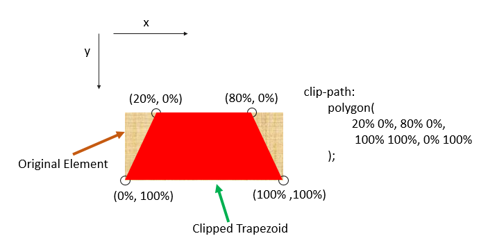
If you don’t want to play with borders, CSS polygon() function is a best alternative to draw a trapezoid. The polygon() function is used with the clip-path property.
In this method, we extract the trapezoid from an element with the help of X, Y coordinates. The clip-path property extracts the area that is defined in the polygon() function. The area that is outside this defined path is completely clipped off.
See this image:

Here is a working example:
Example:
div{
    width: 250px;
    height: 150px;
    background: red;
    clip-path: polygon(20% 0%, 80% 0%, 100% 100%, 0% 100%);
}

