By default, a CSS animation starts slowly at the beginning, progresses faster towards the middle of the animation and then again slows down at the end.
This happens because, by default, the animation-timing-function property is set to ease. The animation-timing-function property specifies how the animation will progress through one cycle of the animation.
When you set the animation-timing-function property to ease, the animation follows the cubic-bezier(0.25, 0.1, 0.25, 1.0) curve which results in a slow start and end of the animation.
So, if you want to make the CSS animation smooth i.e. same speed throughout the entire cycle of the animation, you have to set the animation-timing-function property to linear.
The linear value is same as the cubic-bezier(0.0, 0.0, 1.0, 1.0) curve which results in a constant speed of the animation throughout its entire cycle.
So, add the following code:
/* Make CSS animation smooth */
animation-timing-function: linear;
OR, if you are using the animation shorthand property, you can also specify the linear value there:
/* Make CSS animation smooth */
/* animation-name | animation-duration | animation-timing-function */
animation: move 4s linear;
Let’s try to understand it with a real-world example.
Let’s say we have a div element with a class=”ball” and we want to move it from left to right smoothly using CSS animations.
<div>
    <div class="ball"></div>
</div>
Now, to move the div from left to right, follow the below steps:
- Define a keyframe using the @keyframes rule with some name eg.
move - Add the stages inside the keyframe
- Use the transform property with the
translateX()function to move the div from one position to other - Register the keyframe with the
animation-nameproperty and also specify theanimation-duration - Make the animation smooth by setting the
animation-timing-functionproperty tolinear.
Add the following CSS code:
.ball{
    width: 50px;
    height: 50px;
    background-color: coral;
    border-radius: 50%;
    animation-name: move;
    animation-duration: 4s;
    animation-timing-function: linear;  /* Animate Smoothly */
}

/* Define the animation */
@keyframes move{
    0%{
        transform: translateX(0);
    }
    100%{
        transform: translateX(300px);
    }
}
After running the above code, you will get the following output:
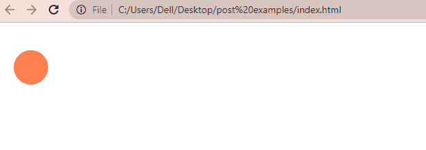
As you can see from the above output, the div element is moving smoothly to the right.
Conclusion
In this article, we learned why a CSS animation doesn’t progress smoothly and how we can make it run smoothly throughout its entire cycle.
To make a CSS animation smooth we have to set the animation-timing-function property to linear. The animation-timing-function property specifies how an animation will progress over its one cycle.
Thanks for reading.