In HTML, an unordered list(<ul>) is mainly used for two purposes, first, to organize a group of related or similar items in an unordered fashion, and second, to make the navbars for our web applications.
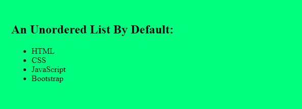
When we are creating a navbar for our website or application using an unordered list, the main problem that we face is how to make the list horizontal, as by default the list items of an unordered list are stacked on top of each other.
As you can see in the following image:
In this article, we will show you different ways to make a list horizontal using CSS. These methods are as follows:
So without further ado, let’s get started.
Method 1: Make a List Horizontal using display Property
In HTML, every element has a default display type which can be block or inline-block or inline. If an element is of type block, it always starts on a new line and takes up the full width of its parent irrespective of the content it has.
By default, all the list items(<li>) have a display type of block. Therefore, when a list is rendered, its items are stacked on top of each other.
So, if you want to make the list horizontal, you have to explicitly change the display type of the list items from block to either inline-block or inline which can be done using the display property.
If you set the display property of each list item to inline-block, the item will not start on a new line and only take up as much width as it requires to fit its content. This will finally result in a horizontal list.
Let’s say we have an unordered list with the following list items:
<ul>
    <li>HTML</li>
    <li>CSS</li>
    <li>JavaScript</li>
    <li>Bootstrap</li>
    <li>Angular</li>
</ul>
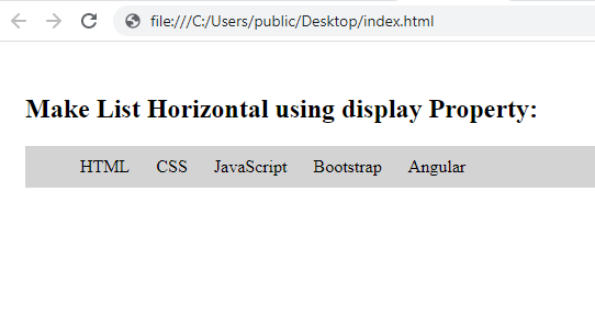
To make this list horizontal, we can set the display type of each list item to inline-block in our CSS file:
ul{
    background-color: lightgrey;
}

/* Change display type to inline-block */
ul > li{
    display: inline-block;
    padding: 10px
}
After running the above code, you will get the following output:
Method 2: Make a List Horizontal using CSS Flexbox
An alternative approach could be to use the flexbox model to make a list horizontal. The flexbox model in CSS is a flexible layout module that lets you easily create responsive web pages without using the float or position property.
To make a list horizontal using CSS flexbox, we have to first make the list(<ul>) a flex container by setting its display property to flex.
Once you make the list a flex container, all its items will start behaving like flex items and you can apply any flexbox property to them.
Let’s say we a the following unordered list:
<ul>
    <li>HTML</li>
    <li>CSS</li>
    <li>JavaScript</li>
    <li>Bootstrap</li>
    <li>Angular</li>
</ul>
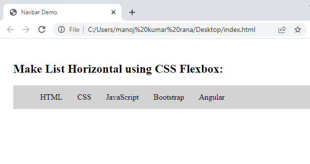
Apply the following CSS to it:
ul{
    display: flex;   /* Make Flex container */
    list-style-type: none;  /* Hide Bullets */
    background-color: lightgrey;
}

ul>li{
    padding: 15px
}
After running the above code, you will get the following output:
With flexbox, we can have more control over the list items. For example, if we want to equally divide the total space(width) of the list among the list items, we can simply set the justify-content property to space-between.
ul{
    display: flex;   /* Make Flex container */
    justify-content: space-between;   /* Divide space equally */
    list-style-type: none;  /* Hide Bullets */
    background-color: lightgrey;
    padding-left: 0px;  /* Remove default padding if any */
}

ul>li{
    padding: 15px;
}
This will give you the following output:
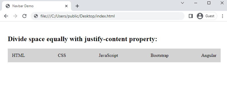
As you can see from the above output, the total space of the list is evenly distributed among the list items when we set the justify-content property to space-between.
Conclusion
To make a list horizontal in CSS, you can set the display property of each list item to either inline-block or inline. When you set the display property of a list item to inline-block or inline, it only takes up as much space as it requires, therefore, the list automatically becomes horizontal.
An alternative approach to make a list horizontal could be to use the CSS flexbox model. In this approach, to make the list horizontal, you can simply make it a flex container by applying display: flex; on it.
With this method, you can have more control over the list items. For example, you can equally divide the space among the list items using the justify-content property.
Thanks for reading.
