Images are an essential part of any website. They not only make the site visually appealing but also play a crucial role in conveying information and enhancing user experience.
When you add an image to your webpage, it is typically rendered in its original orientation. However, there may be situations where the image needs to be rotated for enhancing its appearance or to correct its orientation.
The good news is that with HTML and CSS, you can easily rotate an image without relying on external libraries or plugins.
In this tutorial, I’ll guide you through the steps of rotating an image using simple HTML and CSS. So, without any further ado, let’s begin.
Rotating the Image with the rotate() Function
To rotate an image with CSS, you need two things:
- The
transformProperty - The
rotate()Function
The transform property in CSS is used to apply a variety of transformations to an element. These transformations can include rotating, scaling, skewing, translating (moving), or any combination of these transformations.
The rotate() function is one of the many functions that can be used with the transform property to rotate an element around a specified point.
The rotate() function takes an angle value as its argument in degrees and rotates the element by that angle value, around its center point by default.
The following example rotates the given image 45 degrees clockwise around its center:
<div>
    <img src="images/cat.jpg" width="200" height="200">
</div>
Add the CSS:
/* Rotate image by 45 degress clockwise */
img{
    transform: rotate(45deg);
}
Output:
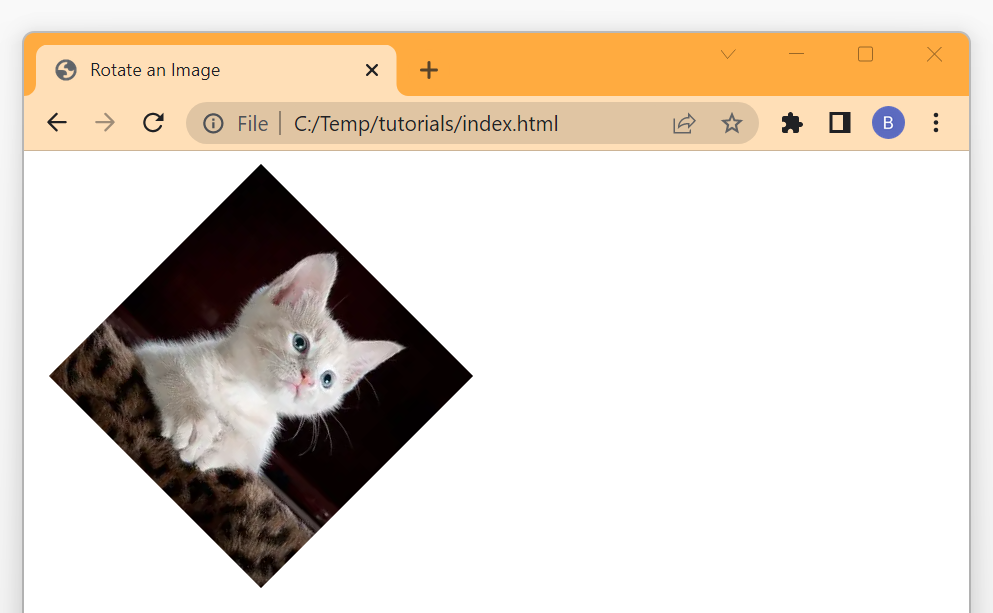
As you can see from the above output, the given image is rotated 45 degrees clockwise around its center.
Rotating the Image Anti-Clockwise with rotate() Function
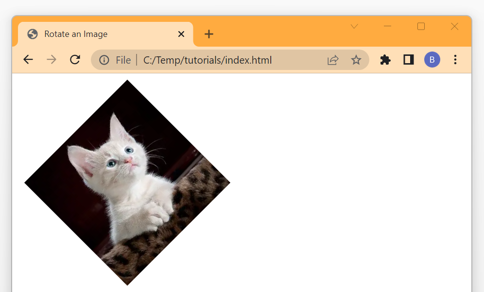
When you pass a positive value to the rotate() function, it rotates the given image/element in the clockwise direction.
But, if you pass a negative value to the rotate() function, it will rotate the given image/element in the anti-clockwise direction.
<div>
    <img src="images/cat.jpg" width="200" height="200">
</div>
Add the CSS:
/* Rotate image by -45 degress anti-clockwise */
img{
    transform: rotate(-45deg);
}
Output:
Rotating Image Continuously with Animation
Now that we have learned how to rotate an image with the rotate() function, let’s try to add an animation to the image and try to rotate it continuously.
To rotate an image continuously, we have to apply a CSS animation to it which will rotate it from 0 to 360 degrees in a given time frame.
The following CSS animation rotates the given image from 0 to 360 degrees linearly in a time span of 5 seconds. To keep the image rotating continuously, we have set the animation-iteration-count property to infinite.
<div>
    <img src="images/cat.jpg" width="200" height="200">
</div>
Add the CSS:
/* Animate the image */
img{
    animation-name: rotate;
    animation-duration: 5s;
    animation-iteration-count: infinite;
    animation-timing-function: linear;
}

/* Define the Rotate animation */
@keyframes rotate{
    from{
        transform: rotate(0deg);
    }
    to{
        transform: rotate(360deg);
    }
}
Output:

Rotating Image on Hover with Transition
To rotate an image on hover using CSS, you can use the transform property along with the :hover pseudo-class.
But without any transition, the rotation effect looks very abrupt and jerky because the image instantly changes its orientation as soon as the user hovers over it.
To make the rotation look smoother and more visually appealing, we can use the CSS transition property. This property allows you to specify how long the transition should take, as well as the type of easing function to use.
<div class="img-wrapper">
    <img src="images/cat.jpg">
</div>
Add the CSS:
.img-wrapper{
    width: 200px;
    height: 200px;
    border: 2px solid red;
    border-radius: 5px;
    overflow: hidden;
}

/* Add the transition */
img{
    transition: all 0.4s;
    width: 100%;
}

/* Rotate the image on hover */
img:hover{
    transform: rotate(10deg) scale(1.2);
}
Output:

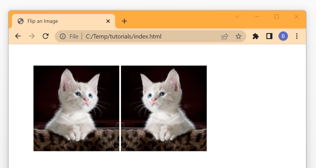
Flipping the Image with Transform Property
To flip an image with CSS, you need two functions scaleX() and scaleY().
If you pass a negative value -1 to the scaleX() function, the image will be flipped horizontally. Similarly, if you pass -1 to the scaleY() function, the image will be flipped vertically.
<div>
    <img src="images/cat.jpg" width="200" height="200">
    <img class="flipX" src="images/cat.jpg" width="200" height="200">
</div>
Add the CSS:
/* Flip the image horizontally */
.flipX{
    transform: scaleX(-1);
}
Output:
Conclusion
In this article, we learned how we can rotate an image with simple HTML and CSS code.
In summary, if you want to rotate an image with CSS, you can use the transform property with the rotate() function.
The rotate() function takes the angle of rotation in degrees as an argument and rotates the given image/element around its center by that angle.
A positive value of angle rotates the image/element in the clockwise direction whereas the negative value rotates it in the anti-clockwise direction.
Thanks for reading.
